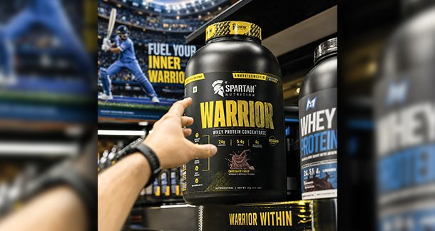
Nobody reads the label first. Nobody checks the price first. The hand reaches out before the brain has caught up. Something about the product just felt right — trustworthy, exciting, worth it. That feeling didn’t happen by accident. Someone built it. And they built it through the packaging.
Packaging isn’t a container. It’s a conversation — one that lasts under three seconds and has to say everything. In sports nutrition especially, where every shelf is a wall of bold claims and louder-than-life branding, that conversation needs to cut through instantly. No room for subtlety. No second chances.
The First Word is Color
There is a proven principle in consumer psychology. When looking at something, a consumer will make a subconscious decision about what they see within the first minute and a half of seeing the product. The most important factor in this decision is color. Color serves a purpose. It conveys a feeling. It expresses authority, and communicates personality and ensures an emotion before the first word is read.
For the performance nutrition industry, the color blue has, until now, been the most common. It has connotations of science, reliability, trust and credibility. The color black signals a premium product and especially serious as well as elite performance. Together, blue and black signify that a product is no-nonsense, clinically approved sports nutrition. It has proven safe and effective.

However, safe needs to have emotion more often than not.
Transformative Impact of a Partnership
Becoming the Official Sports Nutrition Partner of Chennai Super Kings did not just mean gaining a logo to go on our packaging. It meant gaining a whole new identity, a new emotion, a new legacy. This warranted a total overhaul of our visual identity.
We changed our color scheme from blue and black to black and yellow. This change was not cosmetic. It was strategic in every sense.
CSK’s yellow is arguably the most recognizable color in cricket, and for good reason. It transcends cricket, and verges on cultural. It signifies the roar of the Chepauk crowd. It brings to mind a picture of Dhoni standing still at the crease while the whole crowd is going wild. It evokes the sense of a title being won with composure and consistency, not flash. In the context of CSK, yellow carries the kind of meaning and association that most brands struggle to build with their brand colors for decades.
What Yellow Actually Does to the Brain
Yellow is the most active color in the visible spectrum. It triggers what is called the After Image effect, where the eyes quickly shift between objects. It is used in caution signs around the world. Yellow in brands is an eye capturing color, however, it is used differently and paired with different meanings.
In the presence of black, yellow is energizing. It doesn’t talk, it shouts. It is an epitome of positivity, optimism, and boldness. For sports nutrition, it is the ideology you seek. Yellow is warm in the emotional spectrum, and unlike any other color, it is yellow that endearingly connects. In most sports, fans are extremely loyal to the personalities and teams they love, and that warmth connects. It is a commercial tool. People do not just trust brands. They purchase the emotional product.
CSK is More than just a Cricket Team. It is a Way of Life.
When you consider what CSK stands for in Indian sports, it transcends beyond IPL trophies. It is about Staying calm When There is a Lot of Heat Under the Bouncer. It is about doing the right things at the right time. It is about the culture of discipline and the ability to think in a sustained manner over short term bursts of activity.
A brand’s value alignment with consumers is exemplified as extraordinarily powerful in the case of the aforementioned sports nutrition brand. The sleek and professional branding of CSK’s black-and-yellow packaging does not just sell them supplements, or protein, or whatever else; it sells them on the idea of an elite performance that is ‘built’ in a quiet, daily, and regimented manner, through the ‘right’ inputs and ‘correct’ levels of discipline. The packaging is a performance statement.
Moreover, the co-branding does something that purely ‘advertising’ cannot: it brings a sense of identity. CSK supporters are some of the most loyal and passionate in the world of cricket. They have followed and supported the franchise through peaks, valleys, and even a suspension that would have broken most teams. Their Connects to the brand are even identity level deep. When our packaging is designed with the colors and crest of their team, it is much more than an appeal to them. It embodies their identity and becomes a part of how they express who they are.

The rationale for the redesign
The change from blue and black to black and yellow was more than just a color change. It was a complete redesign of visual hierarchy and the weight of
typography, graphic language, and shelf impact. With black now as the primary color, it anchors a performance-first and premium positioning while still providing retail contrast. Yellow, as the accent, provides a psychological lift of energy and optimism while also carrying the CSK identity.
The outcome is packaging that provides the serious, premium sports nutrition message while simultaneously providing a link to the consumer’s established love. Achieving that in a single visual presentation is a result of an authentic brand partnership and focused design intent.

The true return on investment from the psychology of packaging
Brands that understand packaging, understand the most basic fundamentals of the discipline. It is never about designing a box or a pouch. It is about designing a feeling. It is about a split second promise, an unconscious contract, and a brand standing in an aisle.
Purchasing decisions are influenced by color. When brand partnerships are authentic, equity is transferred. When the correct psychological charge is used, packaging ceases to be packaging. It becomes a reason to believe.
For us, adopting yellow was not a loss of our original identity. It was an enhancement of it. Black and yellow combinations do not just look different from blue and black combinations. They communicate, and evoke, something else entirely, and in an oversaturated market, that advantage is all that matters.